
On July 17, Lao Cai Provincial People's Committee announced that the province officially launched a new tourism brand identity, marking a shift in the promotion of the destination's image after the province expanded its development space.
The identification system is built with inspiration from the typical symbols of the Northwest region.
Lao Cai tourism logo is a harmonious combination of images of Fansipan peak, terraced fields, stylized brocade patterns into stars in the center and surrounding clouds.
The design uses soft lines and a balanced color palette, showing the majestic beauty of nature, diverse cultural identity and the friendliness and hospitality of Lao Cai people.
Along with the logo, the province announced two slogans (slogans) used in parallel for each market group.
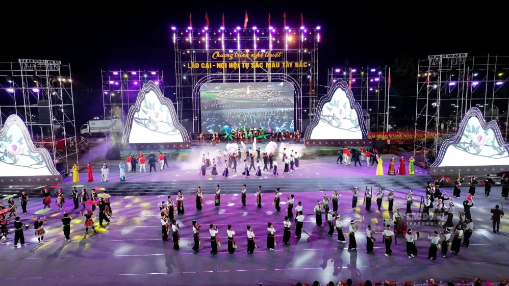
For the domestic market, the slogan "Lao Cai - A convergence of Northwest colors" conveys the image of a destination converging many types of tourism such as resorts, ecology, culture, community, exploration, borders and spirituality.
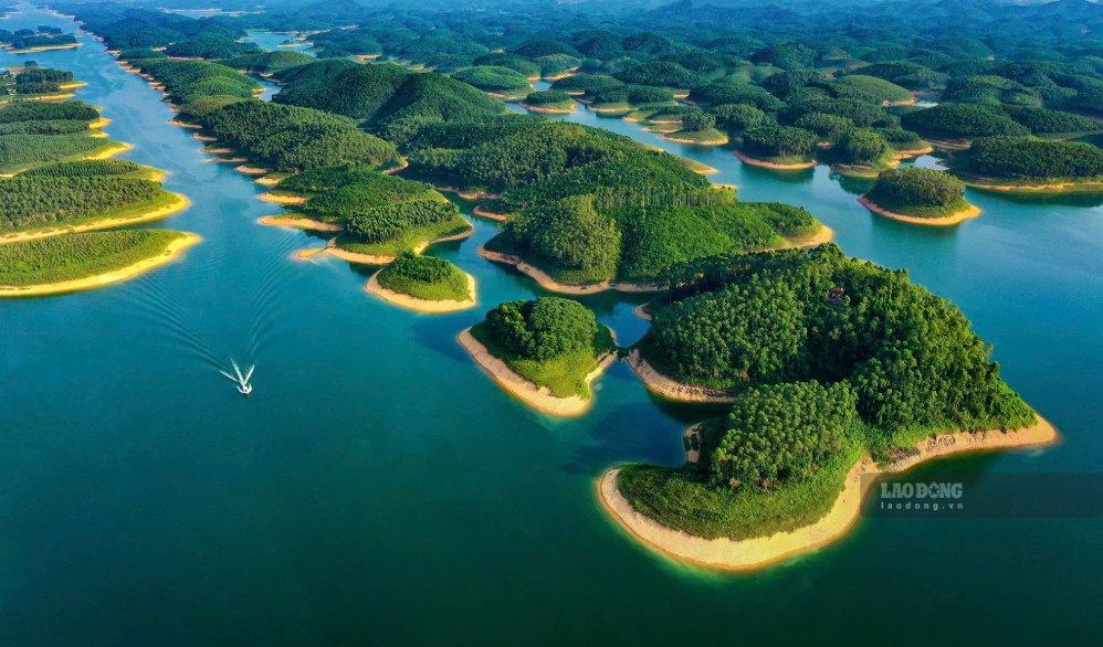
Meanwhile, the English slogan "Lao Cai - The Highland Escape" is aimed at international visitors, emphasizing the experience of resorting, healing and immersing yourself in the nature of the highlands.
According to the Lao Cai Provincial People's Committee, the new identification system will be used uniformly in communication, promotion and tourism promotion activities, contributing to building the image of Lao Cai becoming a unique destination of the Northwest region on the tourism map of Vietnam and internationally.


