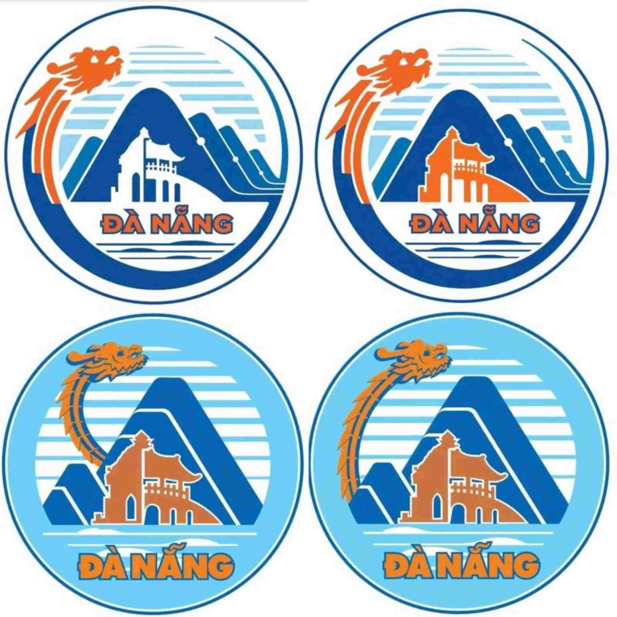
Mr. Nguyen Su said that the logo of Da Nang is not only a symbol but it must have core value, expressing the aspirations of the land and people. logo also positioned the value of the land, affirming the heart of the city - where it appeared.
Therefore, it is necessary to choose a symbol that represents the core cultural values of the land, representing the aspirations of local people towards the future. The way to do it needs to be careful and time-consuming. It cannot be rushed and requires immediate results.
Da Nang is reversing the process.
"The first step that needs to be done is to widely collect opinions from the people, all classes of knowledge, scholars, experts such as architects, culturalists, local scholars, history students, managers, invite them to choose which images, works, scenic spots, heritages... to make symbols. After that, the design competition and community consultation were held.
For example, in the past, when making the logo, the Standing Committee of the Town Party Committee (Hoi An town at that time) consulted with Nguyen Dinh An, Pham Phat, Mr. Dang Minh Phuong, writer Nguyen Ngoc, Professor Tran Quoc Vuong, Phan Huy Le and many intellectuals across the country. They gave me a lot of ideas and advice.
After choosing Cau Pagoda, analyzing and giving full comments, and having many consensus points, we brought them to the Standing Committee, People's Committee, and People's Council for discussion, decision on selection, and announcement to collect public opinions. After that, artist Pham Ngoc Tuan (from Hanoi, living and teaching in France) was invited to design. This artist has given 18 samples and then selected them. However, it took nearly 5 years (2004-2008) to choose the Hoi An logo" - Mr. Su shared.
Mr. Su stated that creating a worthy symbol for a land cannot be a story of one morning after another. It requires time, serious investment, a prestigious appraisal council and most importantly, the extensive participation of the community. Looking back at the logo design contest for Hanoi. In 1997, Hanoi took nearly 2 years, through 3 competitions with hundreds of entries, along with many rounds of evaluation and exhibition to collect public opinions. That meticulous and persistent process helped the capital choose the Khue Van Cac symbol of artist Pham Ngoc Tuan (also the author of the Hoi An logo) which is both solemn and bears the mark of a thousand-year-old culture and meets the criteria of aesthetics and modernity.

Da Nang should refer to previous methods. A logo or logo is not a detailed painting. It is a graphic symbol, an image that is stylized to convey a core message. The power of a logo lies in its suggestiveness and symbolic value, not in listing scenic spots and heritages. A successful logo must be streamlined, unique and flexible in application on many different materials and sizes.


