People's Artist Huynh Hung - former Director of the Department of Culture - Sports of Da Nang City (old) said he was completely surprised to see the Department of Culture, Sports and Tourism (VHTTDL) launch 4 models of the new Da Nang City logo to collect public opinions.
Mr. Hung said that designing a new logo for Da Nang City after the merger with Quang Nam is very necessary, to identify a new land, a new place name, and also a historic turning point for a new development period of Quang Nam and Da Nang.
"However, I felt that this campaign and composition competition was a bit urgent and hasty. She herself does not know which launch or composition contest. How long, when will it take place. How many authors, groups of authors, who has participated... Suddenly 4 design models were selected to be published, collect public opinions and end it within more than 1 week (until July 15), which was too fast" - Mr. Hung shared.
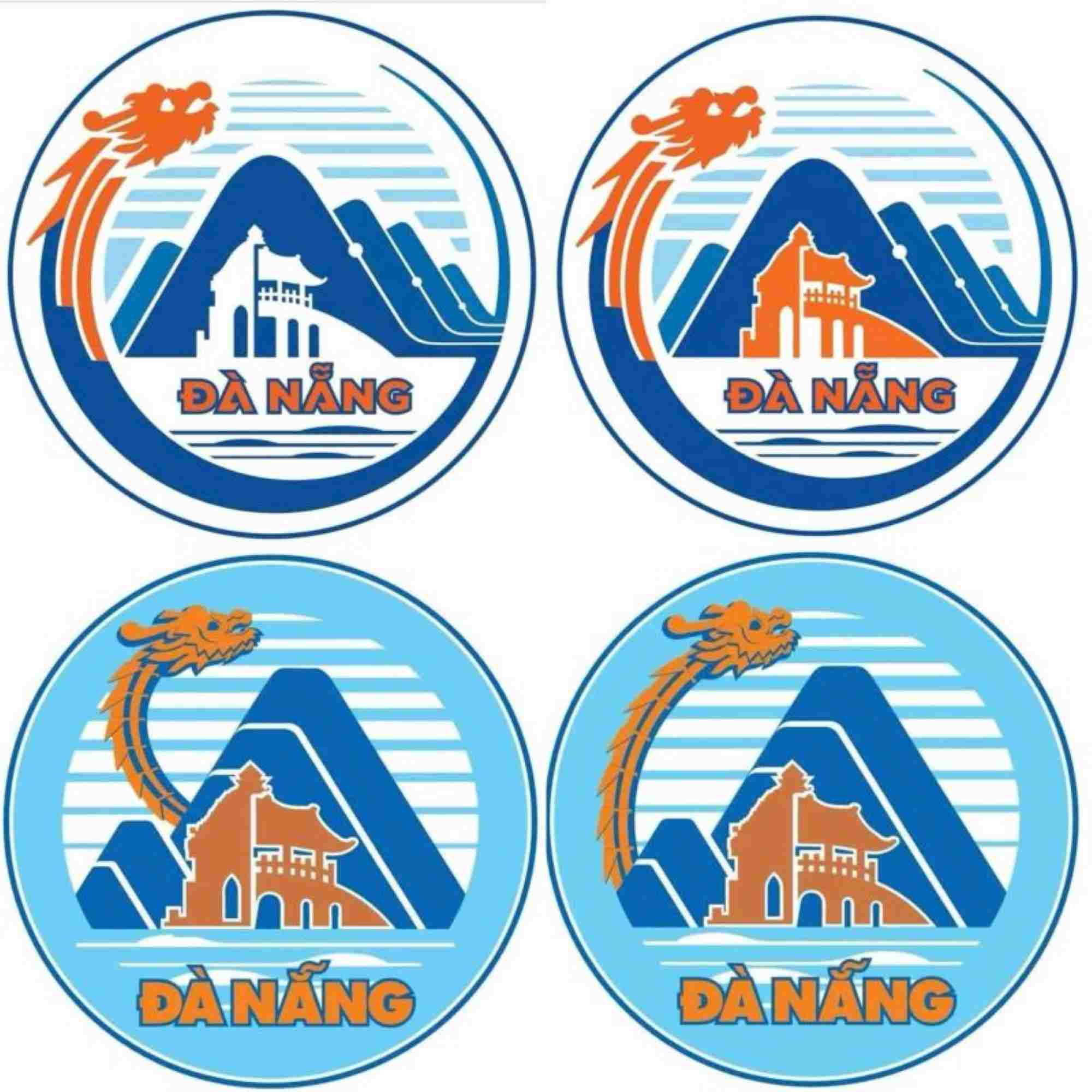
People's Artist Huynh Hung commented on himself: "I do not have information about the 4 logos that the Department of Culture, Sports and Tourism announced, and I collect opinions from a group of authors, 1 good author of many people. But all 4 are similar - with enough symbols of Ngu Hanh Son mountain, Chua Cau (Hoi An), My Son tower temple, Dragon bridge and some sea waves. These logos only have a few different patterns, colors, and sizes.
I also disagree with using the dragon as a symbol. Because the dragon image belongs to the land of Thang Long, Hanoi. Da Nang only has Dragon Bridge and it has only been built for 13 years. Is it enough in terms of length of time and unique cultural value of this land? Personally, my point of view is not to take the image of a dragon.
The last thing is to choose 1 logo, not to use too many representative images, many patterns, lines, colors... making all 4 logos (used for comments this time) too cumbersome. The way".
Mr. Huynh Hung also suggested that the People's Committee of Da Nang City should reconsider the time of organizing this symbol design competition. According to Mr. Hung, there should be more time for more authors and many sectors to participate so that the work is richer and has more options.
Previously, on July 8, the Department of Culture, Sports and Tourism of Da Nang announced 4 selected logo models to collect opinions from agencies, units and people. The end date is July 15, 2025.
According to the explanation of the 4 logos of Da Nang City, the main symbol is the image of a dragon flying up. The dragon is not only a sacred mascot in Asian culture but also a symbol of identity associated with Da Nang, inspired by the Dragon Bridge.
The image of the dragon spreading out to the ocean is a metaphor for a city taking off, affirming its position, connecting globally. The dragon not only represents the strength, charisma and prestige, but also carries the spirit of studiousness, dynamism, intelligence and innovation of the people of Quang Nam - Da Nang through many generations.
The central location is symbolic cultural imprints: Ngu Hanh Son Sphinx, My Son Tower, Hoi An Bridge Pagoda.
A new highlight cleverly placed in the icon is the digital transformation microchip system. The technological lines are stylized into semiconductor chip shapes, both aesthetic and demonstrating Da Nang's role as the leading center for information technology - innovation - smart city in the Central region. At the symbolic foot are wavy curves, familiar images of the ocean, sand beaches, rivers and seaports.


